I have been working on a Data Literacy project with my 6 year year old son the past few weeks (I will cover that topic another time). I wanted to make the charts more relatable for him. To get him to engage with the data side, I found myself developing a few extensions. The project revolves around a game that I built (17 years ago…) and I needed to display the results with his game avatar. And that led to these 2 simple extensions.
Please note: these extensions are experimental and built in an hour with no thought towards using them in production environment. Please read the ‘Readme’ in each project for more details.
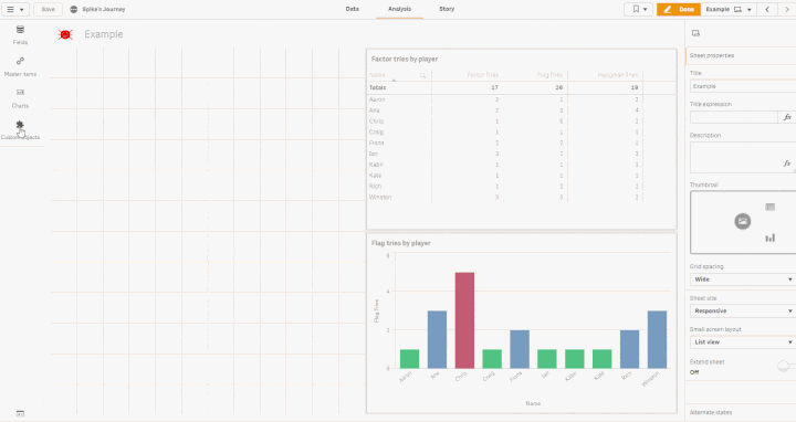
Image Label Bar Chart
This is just a simple bar chart that displays icon/image for each bar. Allows dynamic colouring of each bar based on expression or just a single colour. You can also change the background colour of the chart.
UPDATE: Animations added to the chart now!
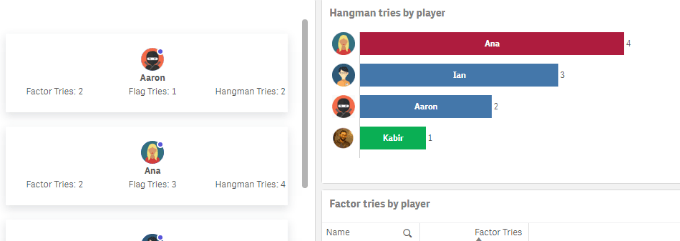
Game KPI
This is a multi KPI extension that allows image/avatar for each dimension and displays 3 measures/KPI per dimension. This is also my first experiment with a css framework on Qlik Sense visual extensions. Turns out, it clashes with Qlik’s default styling, some might say in a good funny way…(Pay attention to the menu accordion in the demo .gif below). This extension contains tool-tips and also has animations which I did not add to the bar chart extension. Spectre css has now been scoped to avoid clashes with Qlik’s styling.